Home
Our Work
Regus

Regus
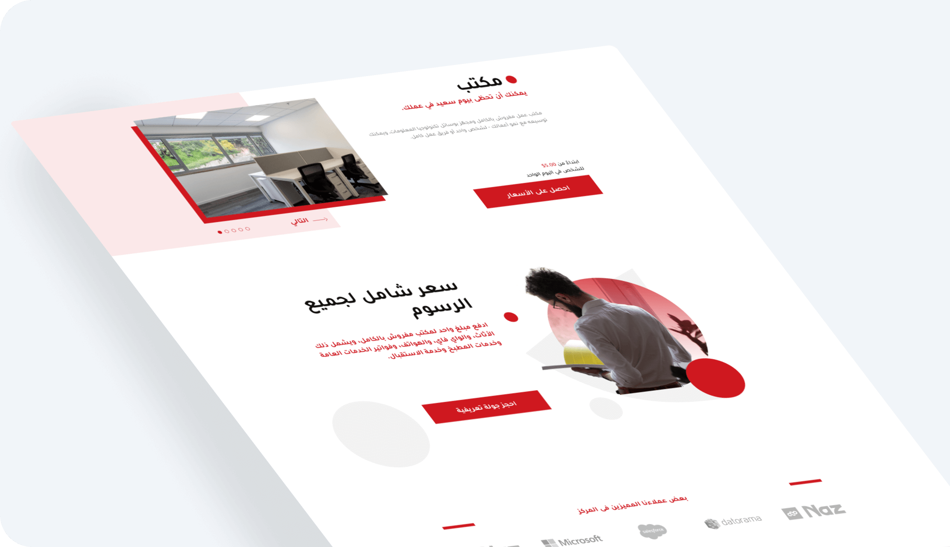
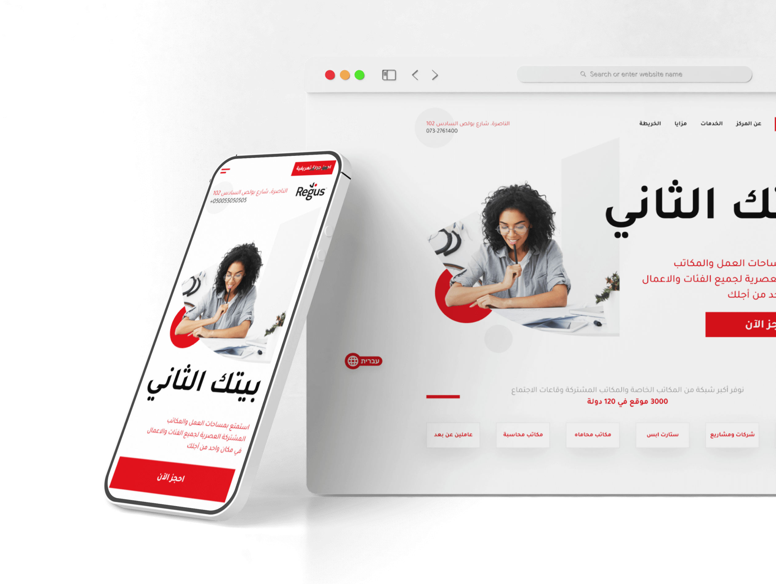
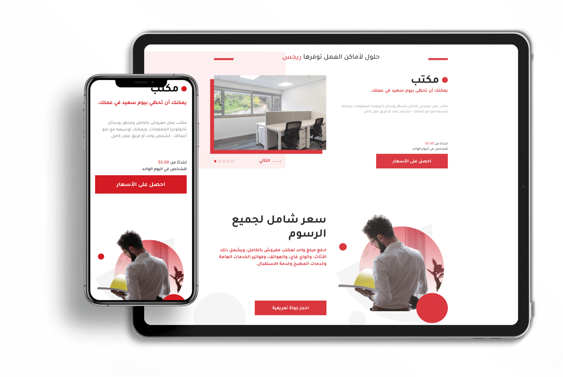
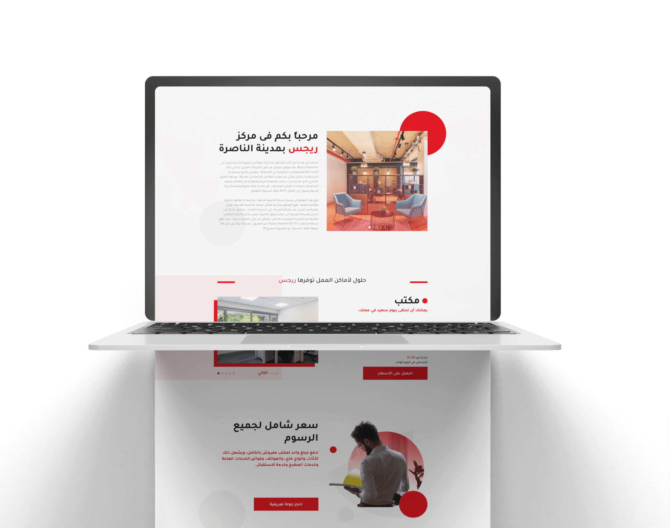
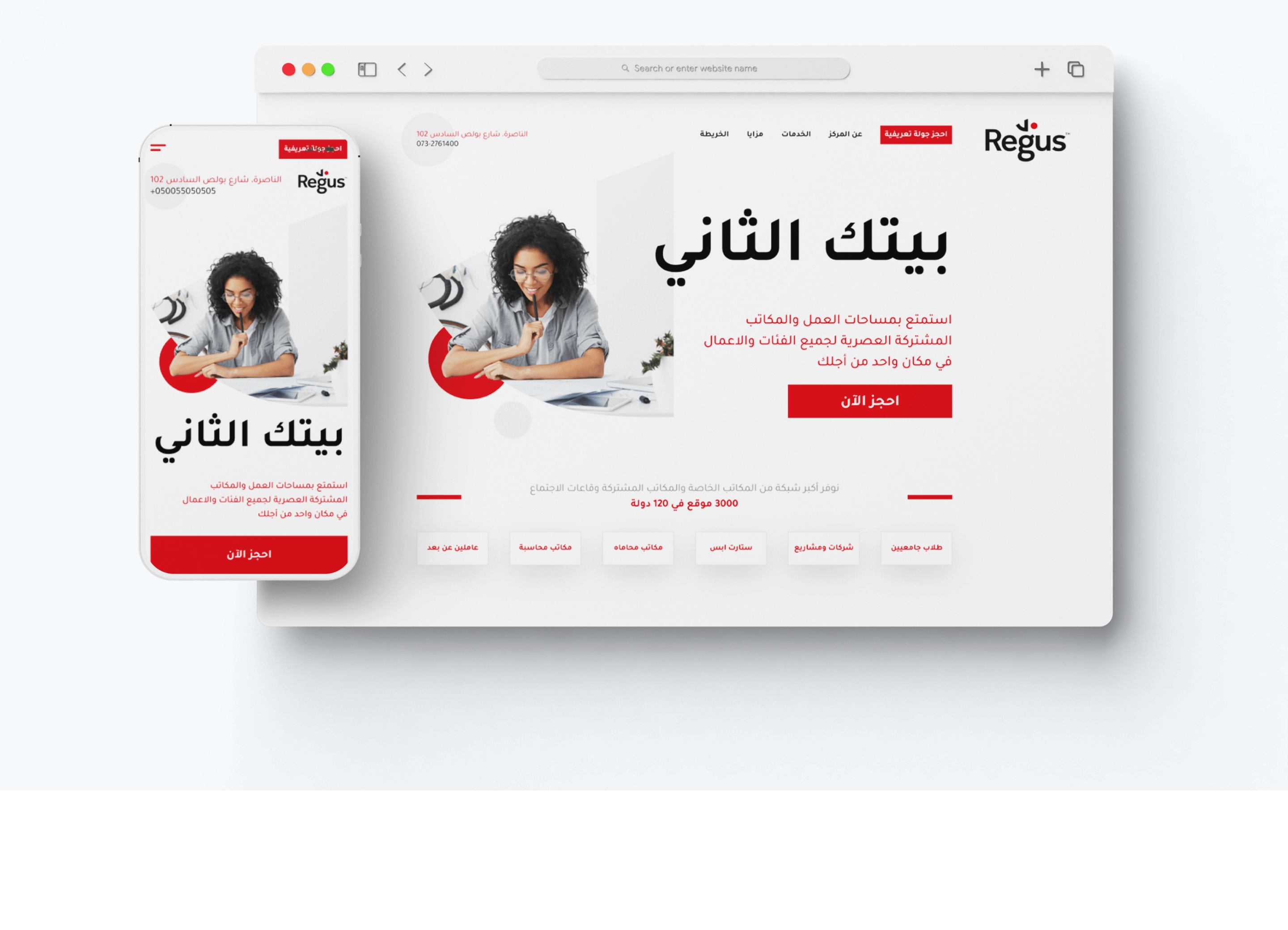
At Nazadv, we were thrilled to work with Regus on building their landing page. Regus is the world's largest network of office, co-working, and meeting spaces and they needed a website that could reflect their vision and professionalism. Our goal was to create a landing page that was not only visually appealing but also effective in generating leads and driving conversions.

Services provided: UI, UX, Branding, Development

Product scope
Finding the perfect gift can be a challenge, especially when it comes to children. Traditional gift shops often offer generic products that lack the personal touch that makes a gift truly special. This can make it difficult to find a meaningful and memorable present that the recipient will cherish.
Creating an accurate representation of the brand: The challenge was to develop a landing page that effectively conveyed the brand’s image and values. We aimed to capture the essence of the brand and create a visually interesting design that resonated with the target audience.
Visuals: The website's design and layout are not visually appealing and do not provide a good user experience. It is important to transform the new product design to improve the overall look and feel of the website.
Providing a seamless user experience: Close collaboration with the Regus team was essential to understand their specific business objectives and requirements. By working closely with them, we were able to align our design approach with their goals and create a landing page that met their needs.
Design Thinking in Action
At Nazadv, we embrace the boundless power of design thinking to craft extraordinary digital journeys. Our methodology extends beyond conventional design practices; it's a living, breathing process driven by empathy, imagination, and groundbreaking ideas. Here's a sneak peek into our approach, where we turn concepts into tangible solutions, breathing life into design thinking

We dived deep to understand business goals, users, and challenges

We pinpoint the problem and set clear project objectives

Our team brainstormed creative solutions and concepts

We brought ideas and sketches to life for rapid testing and feedback

We made improvements based on user feedback and data
What We Did
At the Core of Our Approach to Boosting Regus' Digital Visibility Lies a Harmonious Convergence of Innovation, Technical Excellence, and Strategic Clarity.

Clean Design: We prioritized a clean and visually appealing design for the landing page. By using a minimalist approach, we aimed to create a modern and professional look that aligned with Regus' brand image.

Clear Messaging: We ensured that the messaging on the landing page effectively communicated Regus' value proposition and key offerings. The content was concise, compelling, and tailored to resonate with the target audience.

Intuitive Navigation: We focused on creating a user-friendly experience by implementing intuitive navigation. Visitors could easily find the information they needed and navigate through the page seamlessly, enhancing their overall experience.

Strategic Call-to-Action: The placement of the call-to-action was strategically chosen to encourage visitors to take action. Whether it was signing up for a service, requesting more information, or contacting Regus, the call-to-action was prominently displayed to drive conversions.
Start your project with us
Whether you need a detailed project quote or simply want to discuss your ideas, we're here to help. Choose the option that suits you best
